Load Screen
Description
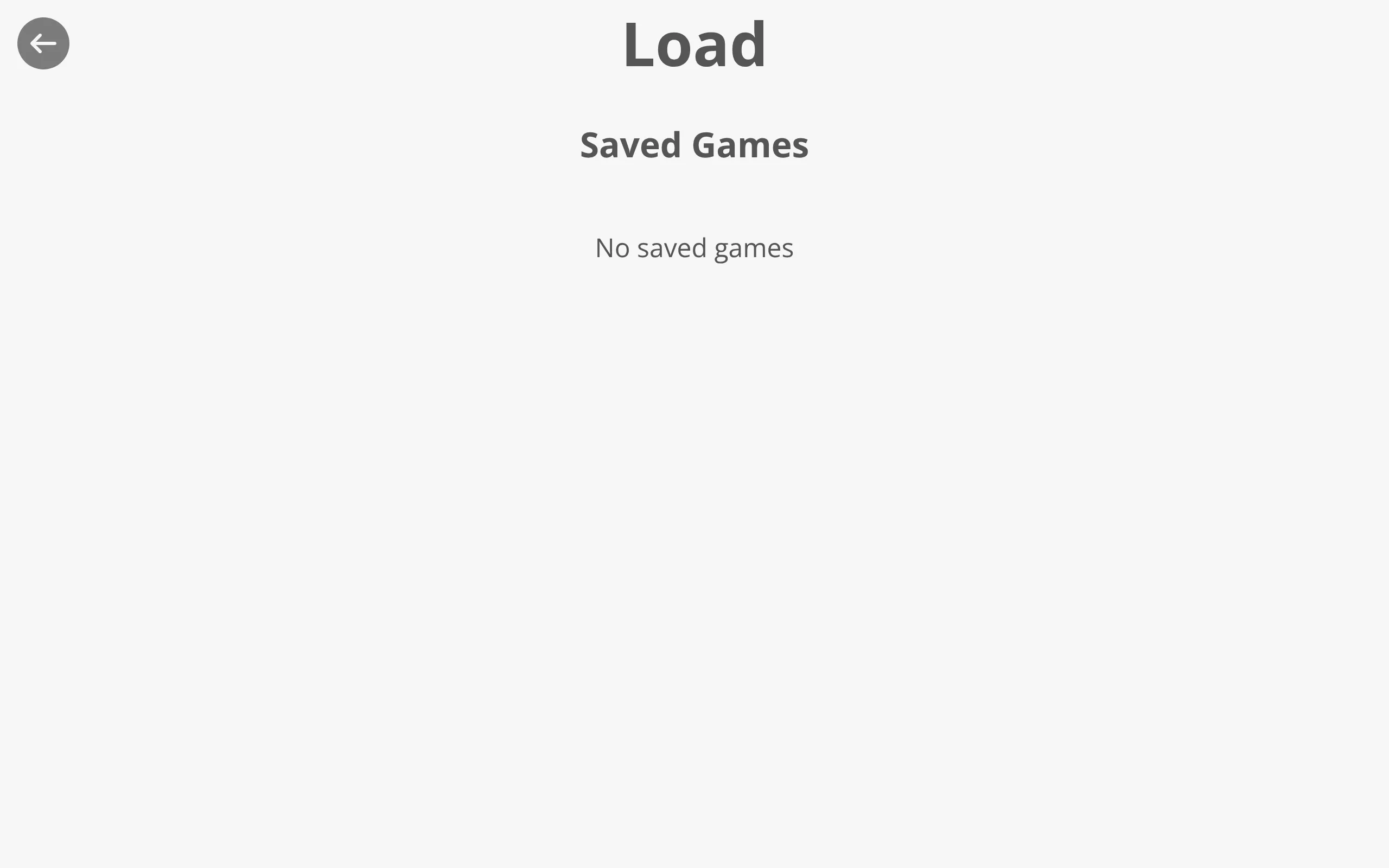
<load-screen></load-screen>The load-screen component lets the player resume a previously saved game. It renders a list of the player’s manual saves and, when auto-saving is enabled, a second list of auto-saves. Clicking a slot loads that game and continues play from where it was saved.
Source Code: https://github.com/Monogatari/Monogatari/tree/develop/src/components/load-screen
Usage
The load-screen is a screen component, so it is shown like any other screen:
// Open the load screen
monogatari.showScreen('load');
While a game is playing, the keyboard shortcut Shift + L opens the load screen.
Structure
The load-screen renders the following structure:
<load-screen data-component="load-screen" data-screen="load">
    <button class="top left" data-action="back"><span class="fas fa-arrow-left"></span></button>
    <h2 data-string="Load">Load</h2>
    <div data-ui="saveSlots">
        <h3 data-string="LoadSlots">Saved Games</h3>
        <div data-ui="slots">
            <slot-container label="Save" type="load"></slot-container>
        </div>
    </div>
    <!-- Only rendered when auto-save is enabled -->
    <div data-ui="autoSaveSlots">
        <h3 data-string="LoadAutoSaveSlots">Auto Saved Games</h3>
        <div data-ui="slots" data-content="slots">
            <slot-container label="AutoSave" type="load"></slot-container>
        </div>
    </div>
</load-screen>
The two <slot-container> elements are rendered in load mode. Their label attributes come from the SaveLabel (default Save) and AutoSaveLabel (default AutoSave) settings. The data-screen="load" attribute and the active class are managed automatically by the base screen component.
NOTE
The auto-saved section is only rendered when the AutoSave setting is a number greater than 0 (its value is the interval in minutes). When auto-save is disabled, the entire autoSaveSlots block is omitted.
State
The load-screen inherits its state from the base screen component.
| Property | Type | Default | Description |
|---|---|---|---|
open |
boolean |
false |
Whether the screen is currently open. When true, the active class is added to the element. |
Slot Lists
The load-screen does not list slots itself; it delegates to the slot-container component, one per list:
| List | Heading string | slot-container label |
|---|---|---|
| Saved Games | LoadSlots |
SaveLabel setting (default Save) |
| Auto Saved Games | LoadAutoSaveSlots |
AutoSaveLabel setting (default AutoSave) |
Each slot in those containers is a Save Slot. When a container has no saves to show, it displays the NoSavedGames message instead of slots.
Loading Flow
Because both containers are created with type="load", clicking a slot loads it. The slot-container loads the chosen save and then resumes play from the saved position. Clicking a slot’s delete button removes that save instead of loading it.
TIP
The save/load flow itself lives in the slot-container component. The load-screen’s job is to render the headings and the two load-mode containers; the click-to-load and delete handling come from the container.
Localization
The screen uses data-string attributes for translatable text:
| String Key | Default | Description |
|---|---|---|
Load |
“Load” | Screen title |
LoadSlots |
“Saved Games” | Heading for the manual saves list |
LoadAutoSaveSlots |
“Auto Saved Games” | Heading for the auto-saves list |
Styling
The load-screen can be styled with CSS against its real selectors:
/* The screen itself */
load-screen {
    /* Your styles */
}

/* Only when the screen is open */
load-screen.active {
    /* Visible state */
}

/* Manual saves section */
load-screen [data-ui="saveSlots"] {
    /* Layout for the manual saves list */
}

/* Auto-saves section */
load-screen [data-ui="autoSaveSlots"] {
    /* Layout for the auto-saves list */
}
Customizing
Restyle the lists
The two lists live in data-ui="saveSlots" and data-ui="autoSaveSlots", each wrapping a data-ui="slots" row that holds a <slot-container>. Target those to lay out or restyle the screen:
/* Manual saves section */
load-screen [data-ui="saveSlots"] {
    /* Your styles */
}

/* Auto-saves section */
load-screen [data-ui="autoSaveSlots"] {
    /* Your styles */
}

/* The row that holds the slots */
load-screen [data-ui="slots"] {
    display: grid;
    grid-template-columns: repeat(auto-fill, minmax(12rem, 1fr));
    gap: 1rem;
}
To restyle the slots themselves, see Save Slot — the load-screen only renders the headings and the two load-mode containers.
Change the structure
To change the markup (for example to drop the headings or reorder the lists), override it with the template() function. Keep the <slot-container … type="load"> elements so the slots are still listed and clicking one still loads it.
Related
- Save Slot - The individual slot markup and the slot list container
- Save Screen - Where players create new saves
- Saving - Save labels, auto-save interval, and screenshots configuration
- Settings Screen - The in-game options panel